Yi David Yang
Things I do
Things I use
Career trajectory
- Design operations & scaling: Established and scaled global design ops across product lines. Led a dedicated team of 3 designers (2 senior ICs, 1 junior IC), establishing critique frameworks, research protocols, and quality standards.
- Strategic system architecture: Architected and scaled a semantically structured design system across 4 core products. Streamlined cross-functional handoffs, accelerating design prototyping velocity by 40% and reducing UI and visual QA cycles by 80%.
- Quality & craft: Maintained high standards of design execution while leading hands-on efforts from customer journey maps to detailed Figma UI specs.
- Executive & cross-functional alignment: Partnered directly with GTM, product management, and engineering leaders to map customer analytics gaps directly to revenue protection initiatives.
Key impact
Identified $2M ARR churn risk; designed evaluate capacity sidebar securing $400k MRR in month 1 post-release and a 50% year-over-year reduction in churn in March 2026.
Accelerated design prototyping by 40% and cut visual QA cycles by 80% through a 1:1 React design system architecture across 4 products.
- Cross-organizational leadership: Led end-to-end UX strategy for a multi-departmental e-commerce digital transformation. Led a dedicated team (1 UX researcher, 1 junior designer) while driving cross-departmental alignment across executive leadership, marketing, engineering, and sales.
- Foundational design ops: Built Avid’s first multi-product design system in Zeroheight from 0 to 1, establishing design operations and governance that enabled full web portal adoption.
- Program-level initiatives: Strategic design lead for Media Composer education programs and core subscription checkout experiences.
Key impact
Led cross-organizational design efforts to increase ARR by $39.4 million, or 19% year-over-year.
Built a multi-product design system from scratch hosted in Zeroheight, achieving full adoption for the e-commerce portal redesign.
Worked in cross-functional Agile team settings. At this point, this was a long time ago, and I’d rather talk about more recent and interesting work. See below.
Things I did
Evaluate capacity sidebar
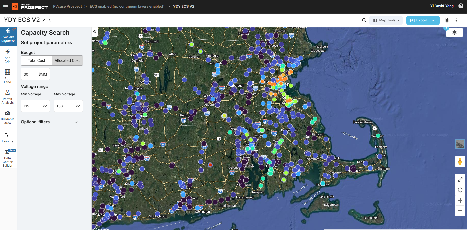
1. What was the problem?
During our renegotiation and renewal phase, we identified a massive $2M churn risk—around 20% of our total ARR. I validated and diagnosed what was going on by digging deeper into product analytics and pairing that data directly with customer-facing calls. Solar developers were hitting a usability wall trying to evaluate grid capacity.
2. What did I do?
No cookie-cutter UX heuristics necessary here. I created a user journey map using raw product screenshots, revealing our “aha!” moment took 6 clicks and was hidden off-page. I proposed a fundamental engineering rework and proved it was necessary by testing prototypes directly on customer calls, demonstrating a clear path to value in 2 clicks.
Execution took 6 months working alongside 3 senior engineers to navigate technical trade-offs, scoping down to a sharp MVP strategically timed for a September 2025 industry trade show reveal.
3. What was the impact?
$400k in new ARR signed within month one post-launch. In-app analytics revealed a 1,200% increase in users reaching success criteria (jumping from 700 to 9,000 flow completions), directly resulting in a 50% year-over-year reduction in churn during our March 2026 renewal cycle.
1. End-to-end strategy & system architecture
Rather than applying surface-level UI patches, I conducted an ecosystem-wide audit mapping user drop-off analytics against existing system bottlenecks. The audit revealed a severe architectural flaw: our primary “aha!” workflow required 6 clicks, and was hidden off-canvas.
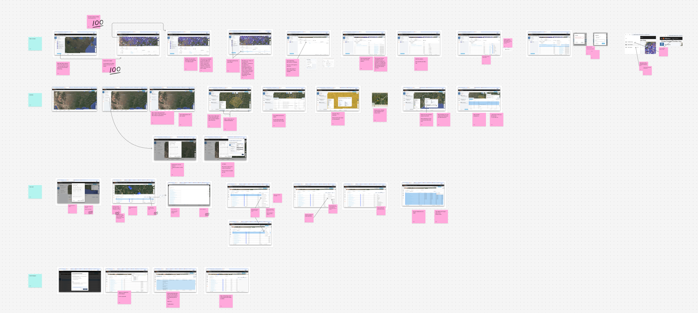
Part of the UX audit of the existing system, highlighting points of friction and number of clicks to get to value
2. Navigating technical & organizational trade-offs
A complete workflow overhaul meant taking on significant technical debt. Working in a tight product trio with engineering and product, I authored the business case for a fundamental architectural rework. I validated low- and high-fidelity prototypes live on customer calls to prove that reducing friction to a 2-click sidebar directly correlated with account retention.
One click
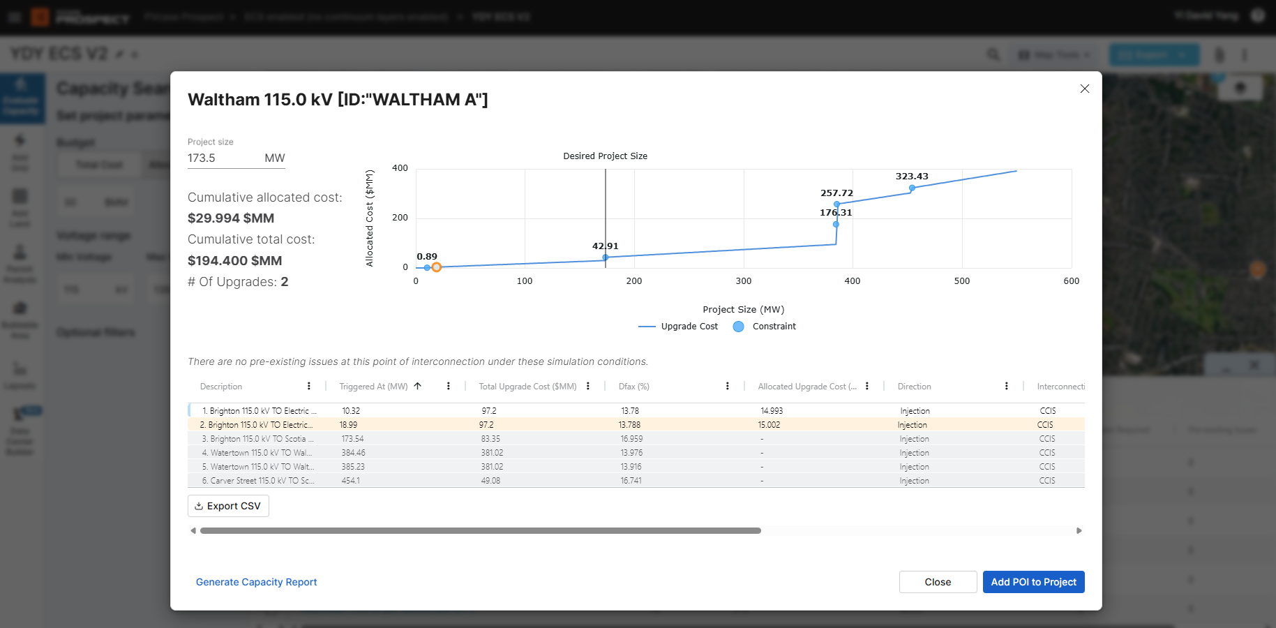
Two clicks
3. Execution & trade-off management
Over a 6-month delivery cycle, I led hands-on technical trade-off negotiations with 3 senior engineers—balancing database query constraints against interface responsiveness to scope a high-impact MVP ready for a major industry trade show.
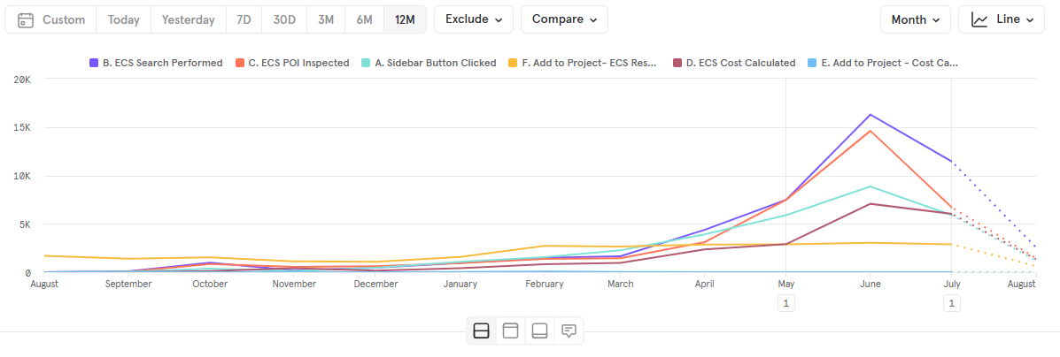
In-app analytics showing 1,200% increase in workflow completions
Measurable business outcomes & analytics growth:
- Immediate revenue launch: Market response at the trade show was instant, generating $400k ARR in new deals signed within the very first month of release.
- 1,200% analytics spike: In-app metrics confirmed massive workflow adoption, showing a 1,200% increase in users reaching success criteria using the new flow vs. the old (jumping from 700 to 9,000 flow completions).
- Long-term revenue protection: Redesigned capacity workflow directly drove a 50% year-over-year reduction in churn during the March 2026 renewal cycle, protecting our core revenue base.
Design system & engineering partnership
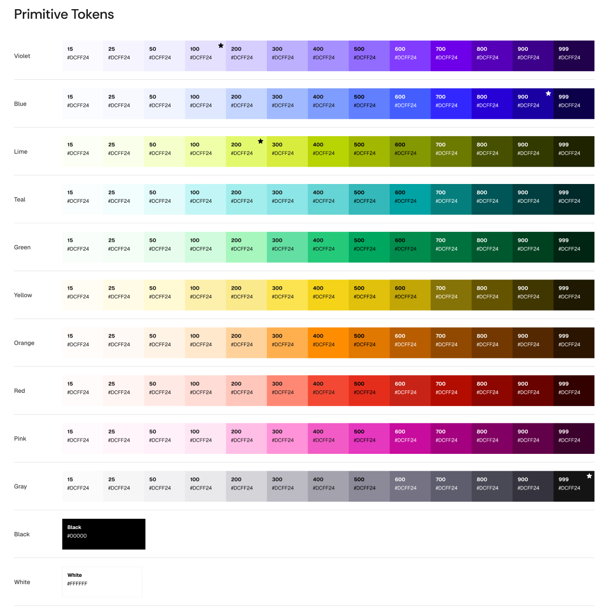
1. Systems impact
Accelerated design prototyping speed by 40% and reduced UI/visual QA review cycles by 80% across engineering teams by implementing 1:1 semantic code tokens.
2. Team mentorship & governance
Mentored a team of 3 designers (2 senior ICs, 1 junior), establishing cross-product governance models and WCAG 2.2 accessibility standards.
3. AI & future readiness
Structured machine-readable token architecture makes the system immediately consumable by Claude Code for rapid prototyping.
1. Core philosophy & measured systems impact
A design system is a dual-sided force multiplier that unlocks scaling, speed, and a uniform experience. By pairing semantic token architecture with a 1:1 React code component library, we transformed design-to-engineering workflows across 4 product suites.
Quantified organizational impact:
- 40% faster design prototyping: Standardized tokens and layouts enabled designers and engineers to construct and test high-fidelity workflows in nearly half the time.
- 80% reduction in UI & visual QA: Eliminating arbitrary styling debt reduced visual bug reports and QA review cycles by 80% during release candidate testing.
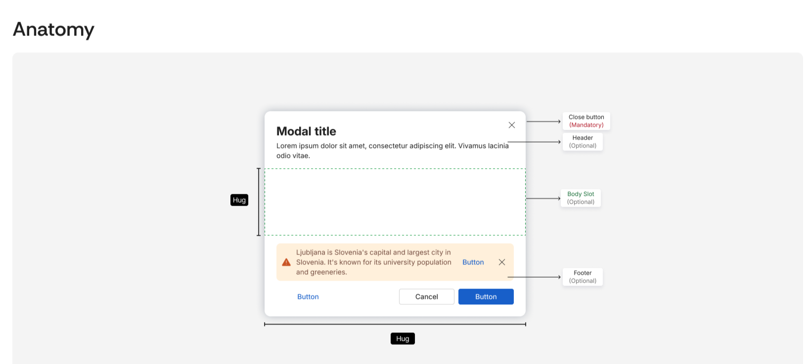
Modal component anatomy
2. Team mentorship, governance & engineering partnership
A design system is completely worthless without an engineering partner who believes in it just as strongly as design does. I co-led design system governance alongside front-end engineering leads, establishing contribution frameworks and design operations.
I directly mentored a team of 3 designers (2 senior ICs, 1 junior IC) on token structures, component specs, and accessibility protocols to ensure unified craft standards across all product lines.
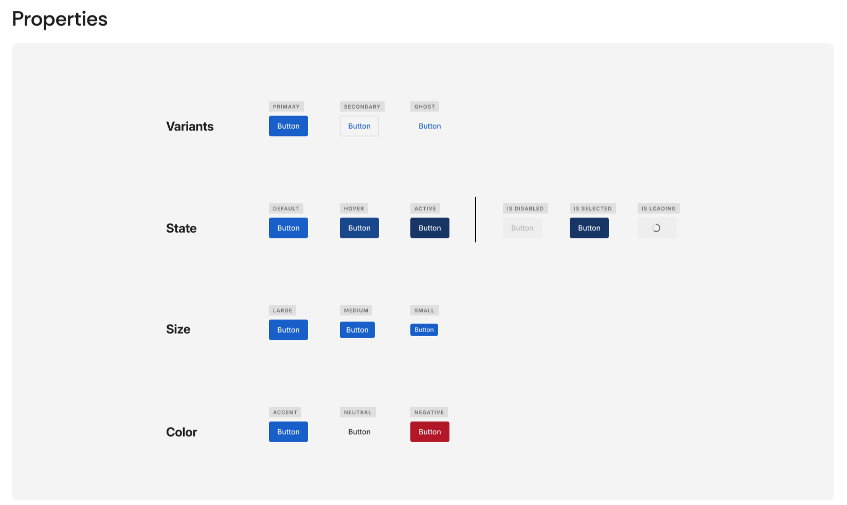
Figma specs
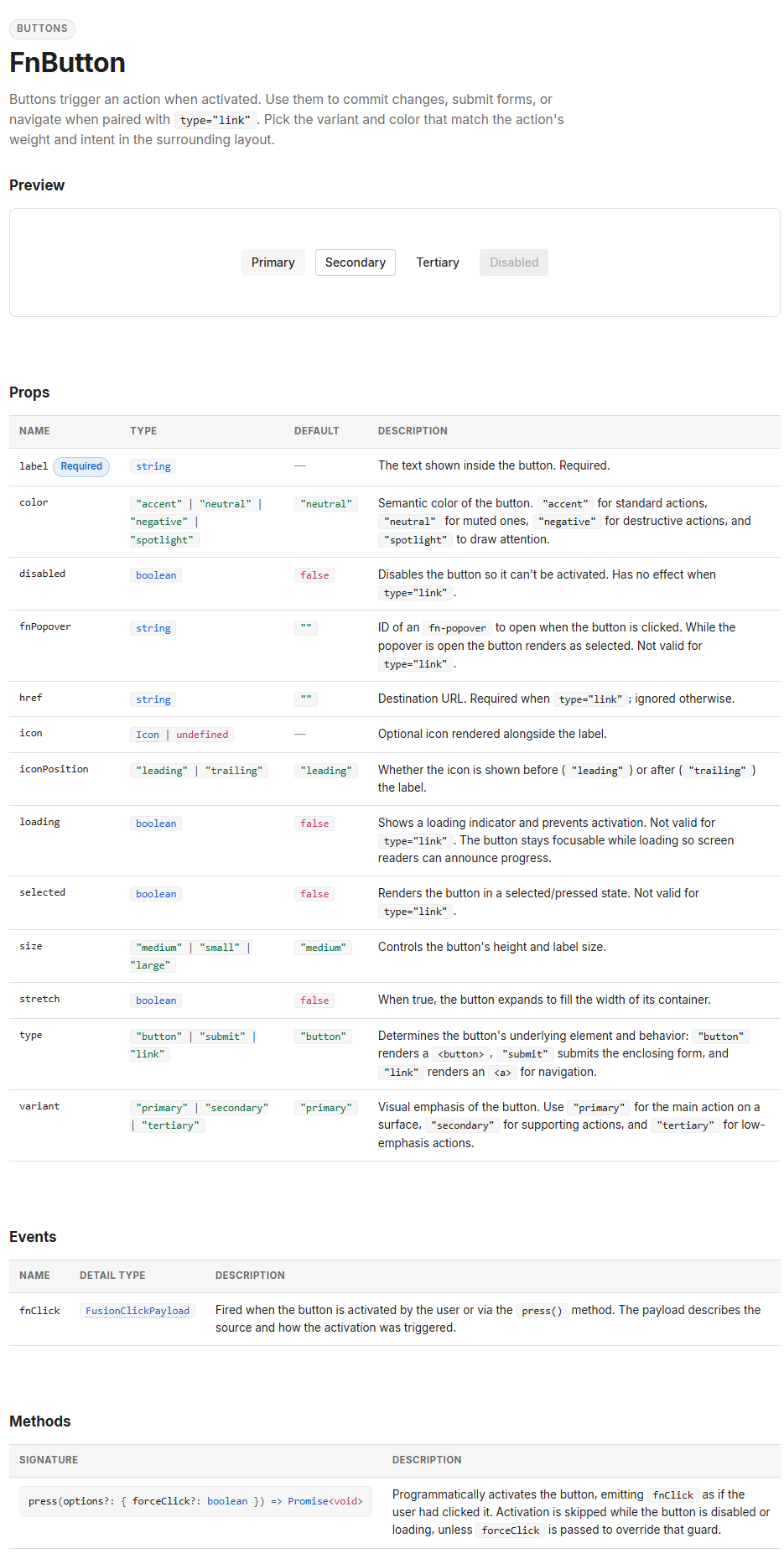
1:1 Code component implementation
3. Standards & architectural hard rules
To build interfaces that scale gracefully, I hold strict technical standards in my design workflow:
- WCAG 2.2 compliance: Native WCAG accessibility compliance built directly into base component states.
- UI vs. brand separation: Marketing palettes are designed for attention; product interfaces require legibility, hierarchy, and restraint. Primary brand assets are adapted before entering functional UI tokens.
4. AI, design systems & future readiness
Because I set up our design system with clean token architecture and strict semantic naming, it turned out to be immediately consumable by AI coding assistants like Claude Code and Cursor. Today, we plug our tokens and component specs into AI workflows to execute polished, on-brand prototypes in minutes.
Example component spec sheets
Click any spec sheet below to open with interactive zoom and pan controls:
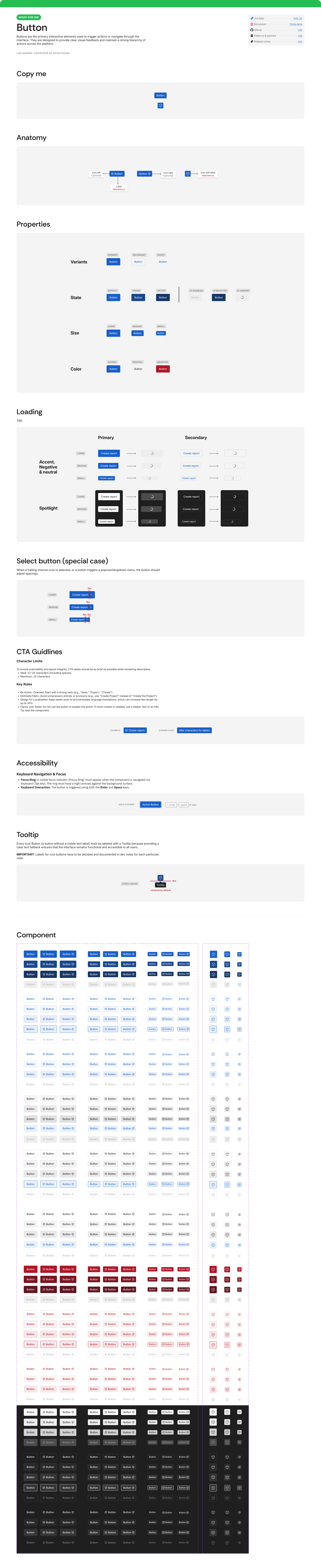 🔍 Click to inspect & zoom
Button component complete spec sheet
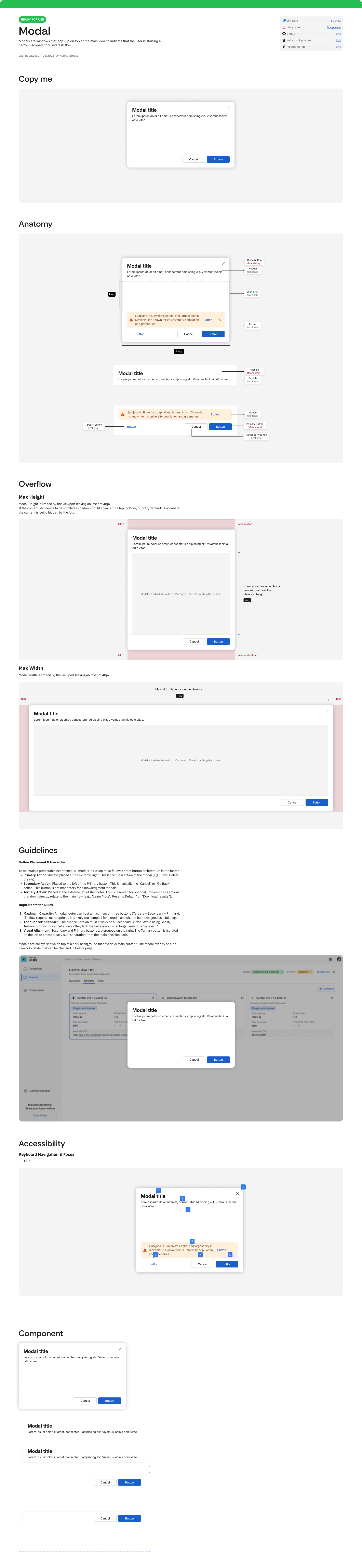 🔍 Click to inspect & zoom
Modal component complete spec sheet