Concept Design - E-Commerce Website
Summary
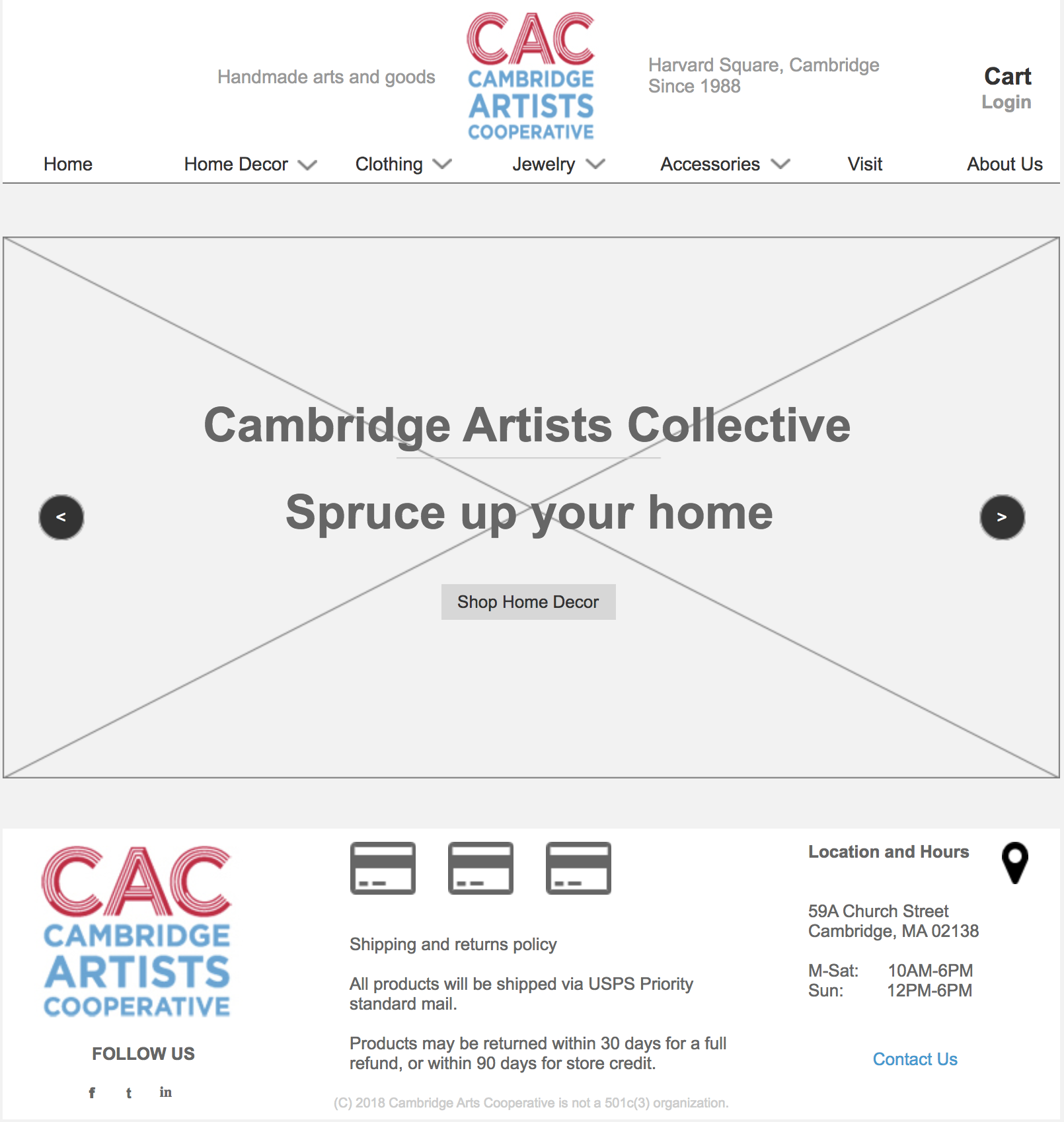
Cambridge Artists Cooperative (CAC) is a brick-and-mortar store in Harvard Square, Cambridge, founded in 1988, staffed by and featuring the works of independent artists across the United States.
In 2018, CAC needed a way to compete and survive in a shifting economic landscape. This is how I redesigned their website with an e-commerce focus.
Overview
Platform
Desktop Browser
Timeline
2 Weeks
Role
UX Designer-in-training, General Assembly
Skills and tools:
User Research, Information Architecture, Paper Sketching, User Flows, Wireframes, Site Map, Sketch app, Clickable Prototype

Discovery
The Approach
User Interviews
I screened and interviewed nine people who purchased handmade arts and goods who had varying levels of comfort with online shopping, and gathered some common trends from an affinity map of the data.
“I like interacting with the artist.”
“It’s frustrating when a site is difficult to navigate.”
Supporting independent artists is important.
People often shop for a specific occasion (wedding, birthday, anniversary, etc.)
Some avoid online shopping because it’s difficult to know the dimensions.
Competitive Analysis
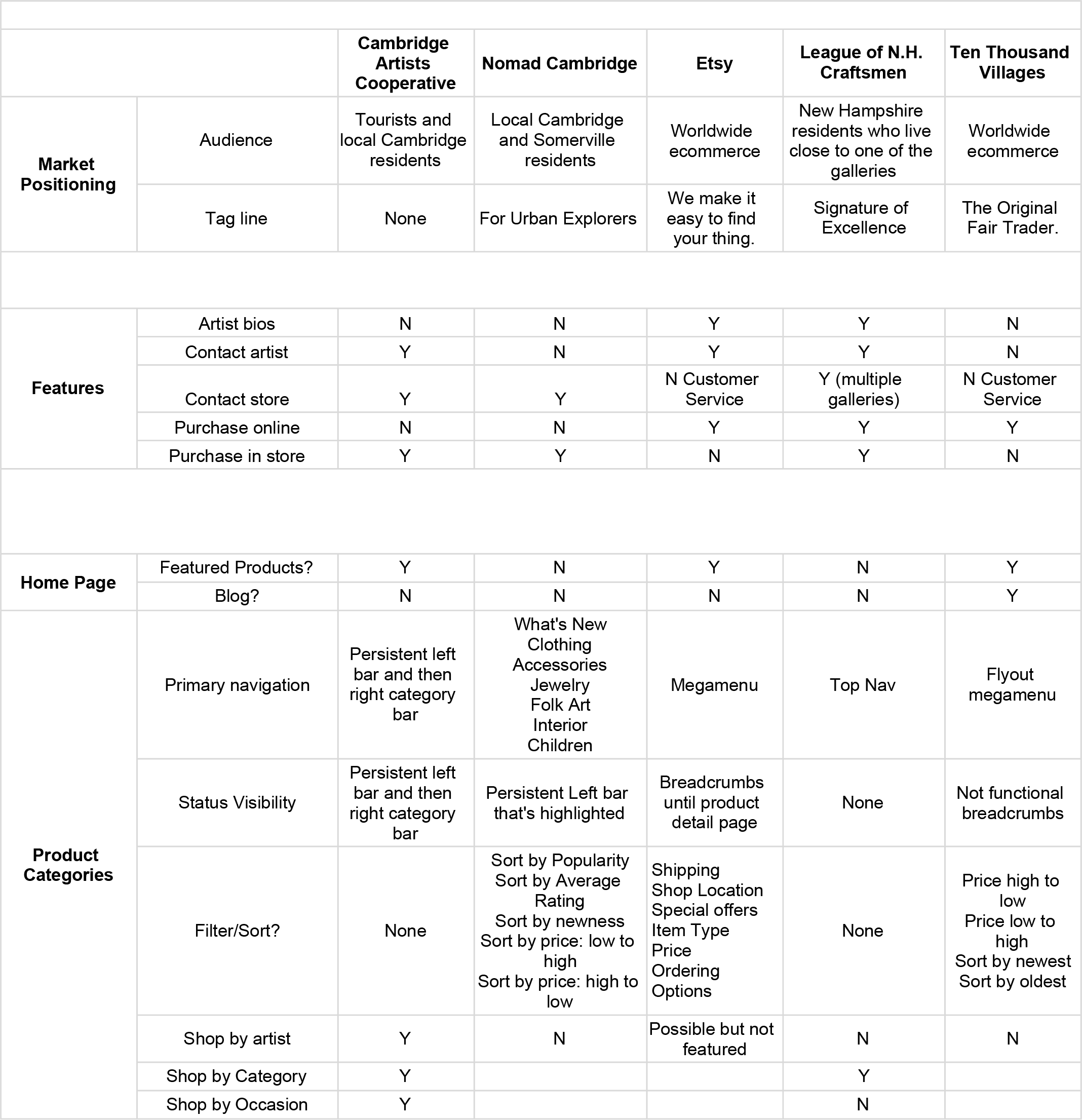
I analysed competitors based on criteria of market position, features, e-commerce capabilities, site usability, as well as their information architecture.
Competitive analysis of independent, handmade craft good stores in New England revealed that most business in this niche industry has not adopted an e-commerce platform.
The Problem
Artists don't speak the same language
I realized the biggest challenge was going to be information architecture; specifically, taxonomy of products.
While artists primarily organize products by materials, consumers regard those category more as filters, and categorize products based on function and/or room location.
This dichotomy of artist vs consumer categorization also played out in the current ecommerce platforms. The websites of smaller, artist-led organizations organized primarily by material or artist, while larger online retailers would organize categories by room, then function.
Ideation
The Solution
How I chose the wheel
There were three methods of product organization which e-commerce sites used:
- By Artist
- By Occasion
- By Category
I analysed through the perspective of the user which method would be useful for the user.
- By Artist: Unfortunately, this method relied heavily on recall rather than recognition to find a product - the user would need to already know which artist made it. This is effective for a secondary user that follows and knows artists.
- By Occasion: This type of curation relies heavily on the subjective taste of the curator, and also the taste of the user to an extent.
- By Category: While also somewhat subjective, this was the most scalable system.
Card sorts
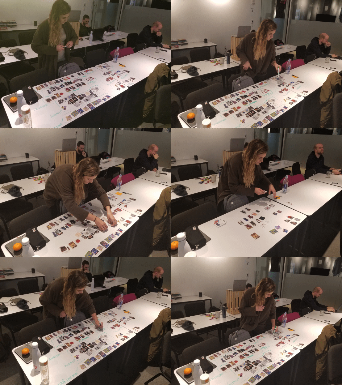
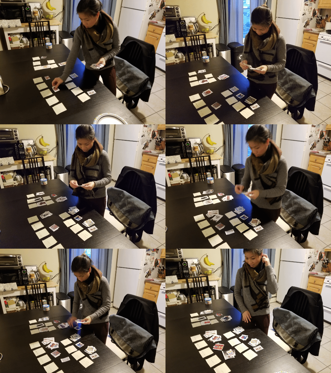
To create a robust categorization taxonomy, I conducted a series of open card sorts to generate category names using 100 photos of products sold at CAC.
I tested and refined the taxonomy with a closed card sort of the same 100 products.
The most problematic products to place were wooden, hand-carved utensils; during both the open and closed card sorts, people were hung up on whether to place them under kitchen or decor. The dual property of its practicality was especially confusing. In the end, people were satisfied finding it under Decorative Kitchen & Dining.
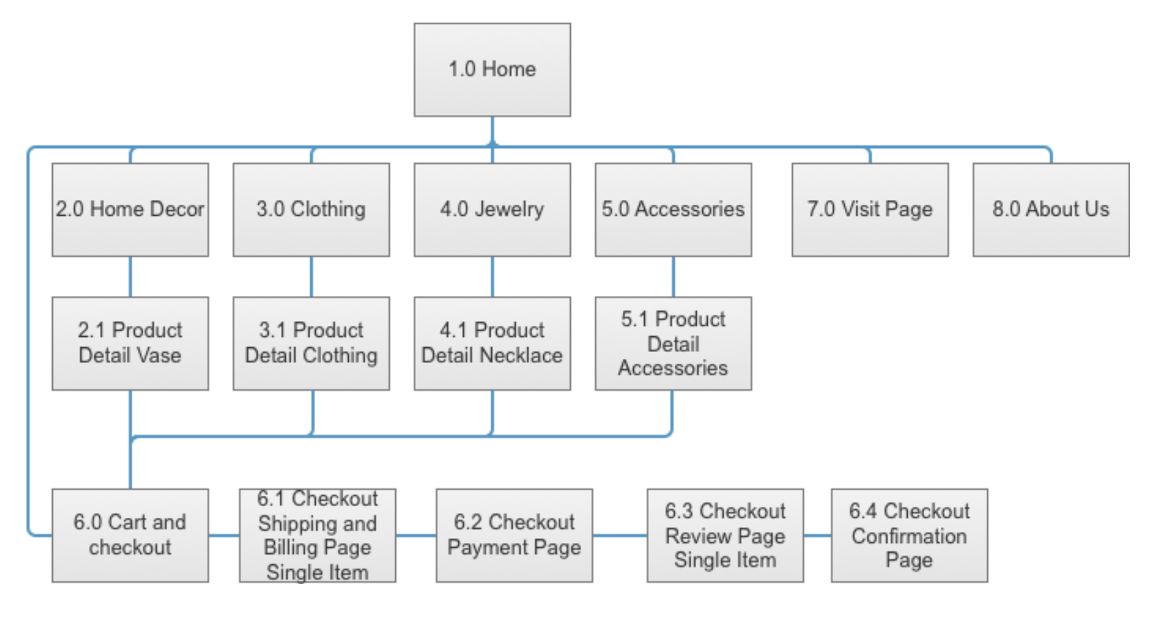
Site Map
In order to settle on which screens I'd need to design, I created a site map to have an overview of the information architecture of the site.
Sketches and wireframes
To settle on layout, I did the heavy lifting paper sketches prior to wireframing.
My process for each page was:
- Draft a version of a screen
- Reflect on what was prioritized on that iteration
- Note what went wall and what could be improved
- Do another iteration
- Repeat 1-4 until I was happy, and move into a digital wireframe.
The Execution
Tweaks
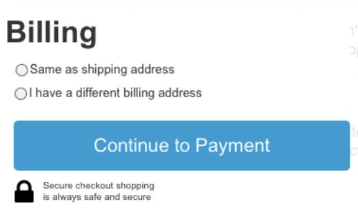
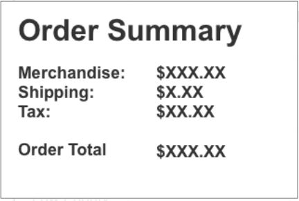
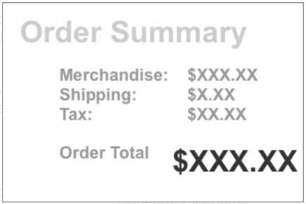
I adjusted several elements based on user testing.



The MVP
The MVP of this project was a lo-fi digital mockup of an e-commerce platform.
Outcome
Next Steps and Reflections
- While an e-commerce platform connects CAC with a larger audience and consumer base, the charms and advantages of a craft goods is evidently missing online; being able to touch, see, and smell the art is something users across the board found attractive about visiting stores in person.
- I wanted to preserve the personal interaction with the artists during the purchasing experience. One possible solution was to heavily integrate a messaging platform throughout the site and especially on each product detail page.
- The creativity of artists meant there was a large variety of goods - as the gallery updates, the subjective categories my users came up with and defined may need to be updated to accommodate new items that can't find a home in the current taxonomy.