Tough Mudder Mobile Application - Concept
Problem
Tough Mudder participants currently do not have a platform for team coordination.
Solution
A seamless mobile experience to promote team identity, from registering to training.
My Role
- Team Lead
- Project Manager
- UI Design
- Information Architecture
- User Research
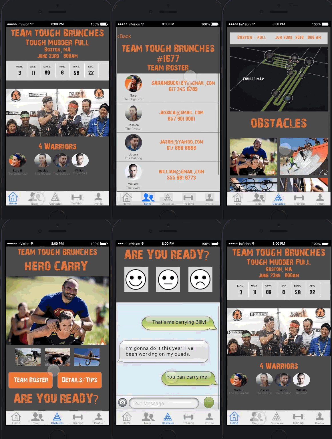
Background
Tough Mudder is a team-focused, 10-12 mile, untimed obstacle course.
In 2018, Tough Mudder wanted to increase its number of repeat participants by strengthening the team experience.
This is the story of my design process of creating a team-based mobile experience.
Overview
Platform
iOs
Timeline
2 Week Design Sprint
Role
Team Lead (3 members)
Skills and tools:
User research, paper sketching, user flows, wireframes, paper prototyping, site map, Sketch app, clickable prototype, project management
My Role
I led a team of two fellow UX designers at General Assembly, Nicole Ambrosio and Michael Greig. I managed the project’s two-week timeline and deliverables.
We conducted research through competitive analysis and user interviews, synthesized findings, created a solution statement, and executed a high-fidelity clickable prototype.
I recruited and conducted user interviews, directed the development through feature prioritization and paper prototyping, and created a hi-fidelity prototype.
The information in this case study is my own and does not reflect the views of Tough Mudder.
Discovery
The Approach
What sets Tough Mudder apart?
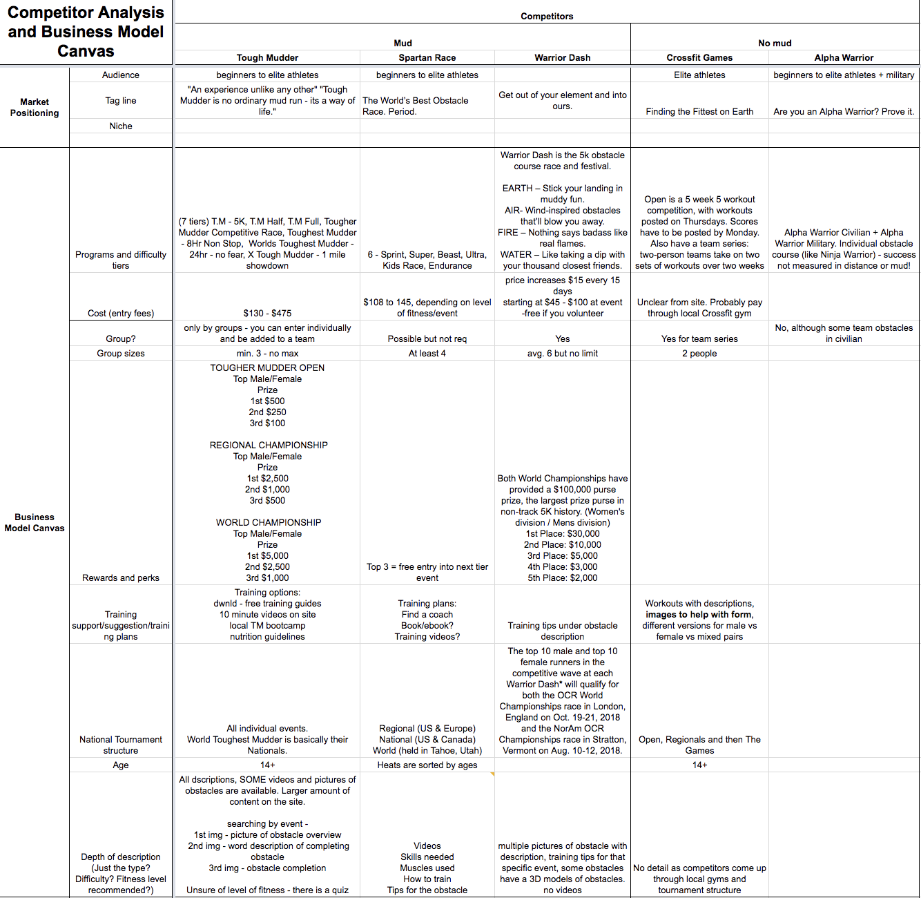
My team dug into competitive analysis to see what edge Tough Mudder had over the competition. We used Google spreadsheets for collaborative editing capabilities.
We evaluated over 11 different obstacle-based athletic events based on their market positioning, pricing, level of athleticism or fun, and content provided to their users.
What's keeping people from returning?
I interviewed 14 people who had attended Tough Mudder in the past about their experience.
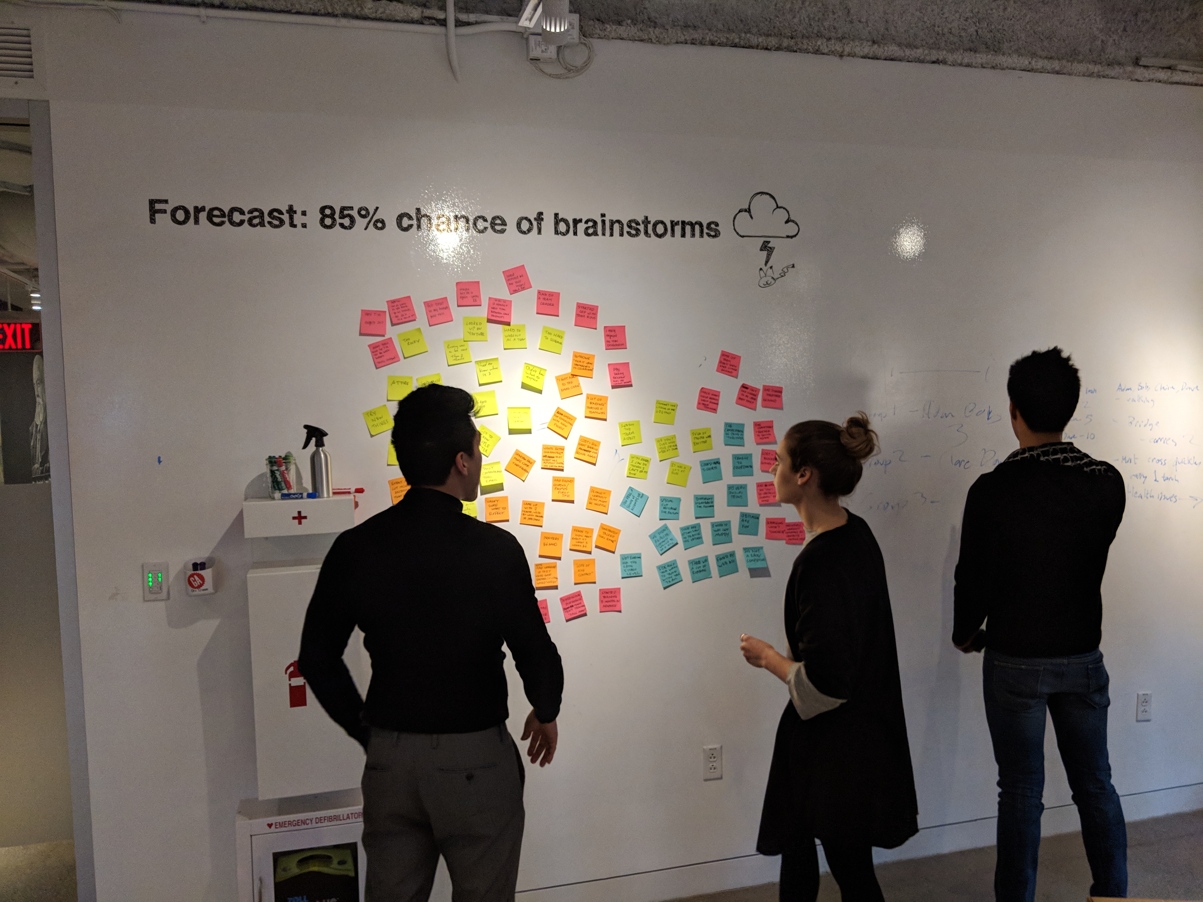
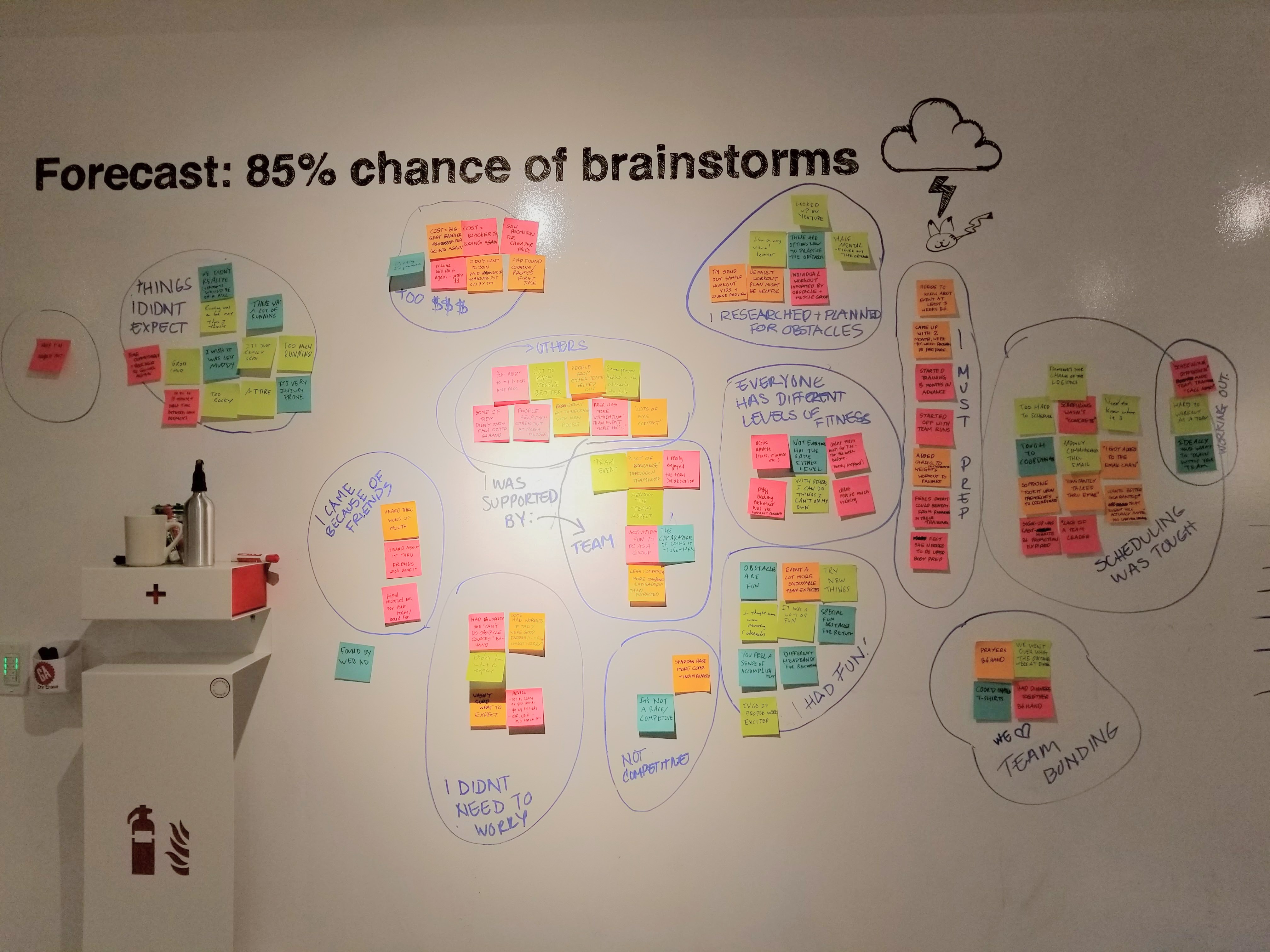
To sort the interview findings in an affinity diagram, we wrote down quotes from the interviews on post-it notes. Then, we grouped together similar thoughts to reveal latent trends and behaviors.
Synthesis
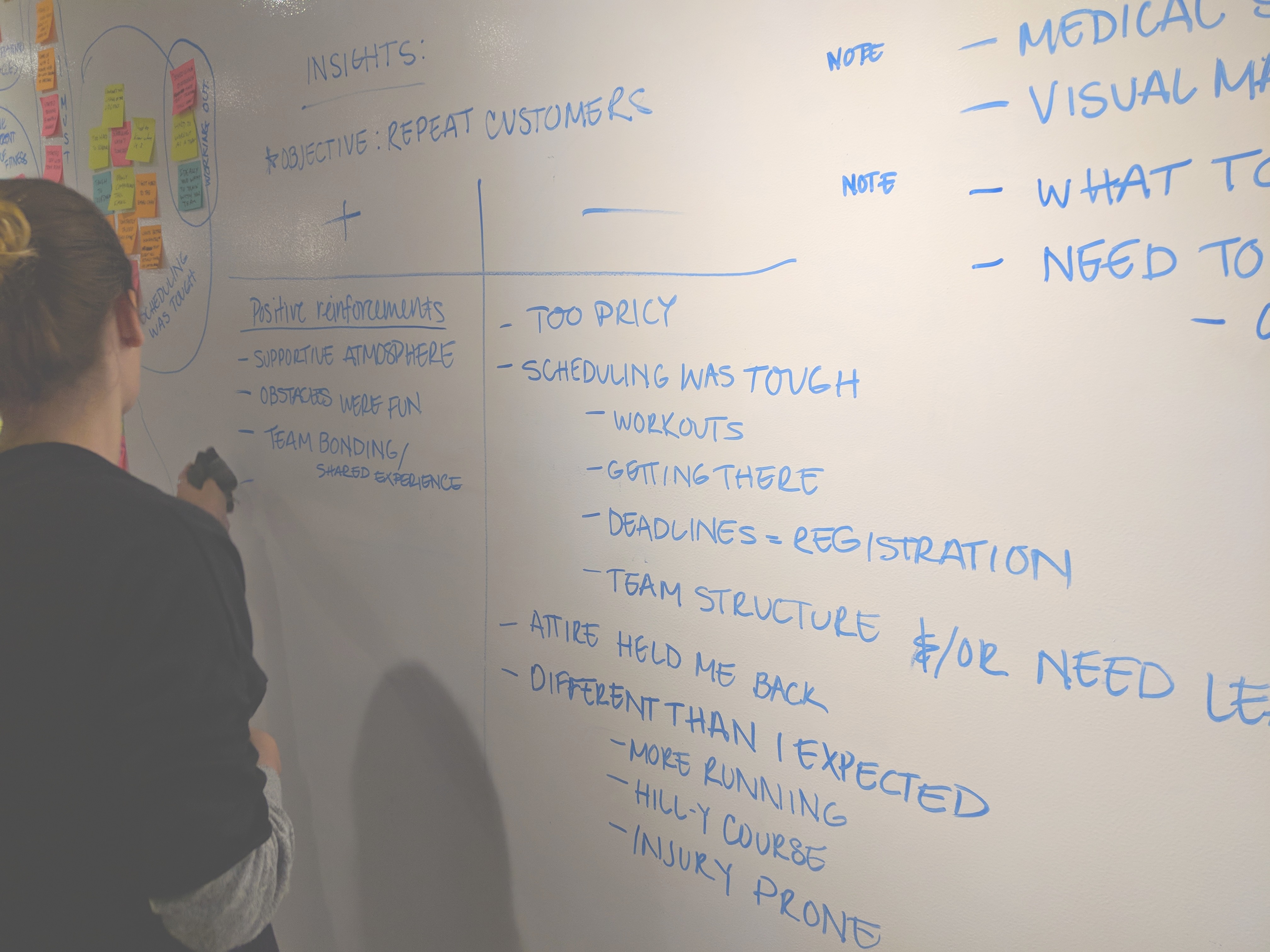
The Problem: Tough Mudder participants currently do not have a platform for team coordination.
Tough Mudder is an interesting and appealing mix of a fun obstacle course and athletic challenge. People of all fitness levels had a fulfilling experience. Its distinguishing features is the team focus, as well as the carefully crafted obstacle experience.
“It [Tough Mudder] was a lot funner than I expected.”
“Our team’s fitness was all over the place.”
“I really enjoyed the team aspect, and that other people would help you out.”
“You have to coordinate everything yourself.”
A glaring issue was the existing lack of a team platform in the current Tough Mudder registration experience. Many of the participants described pain points regarding team coordination, both in training as well as the logistics of registration and getting to the event.
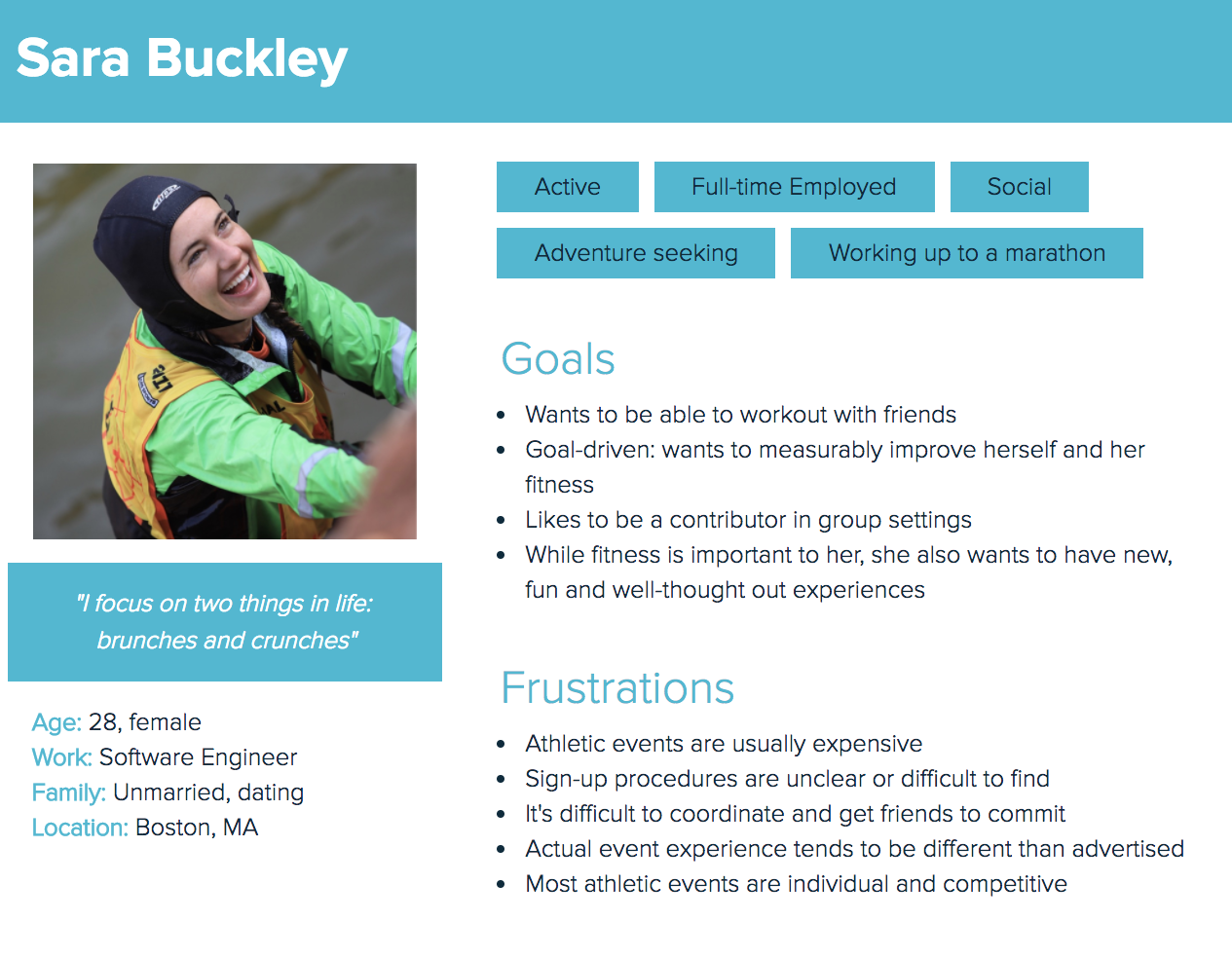
We embodied these research insights in a persona: Sara Buckley.
Sara represents our target user: an social, adventure-seeking young professional, who is frustrated by convoluted sign up procedures and difficulty in coordinating with friends.
Ideation
The Solution
A seamless mobile experience to promote team identity, from registering to training.
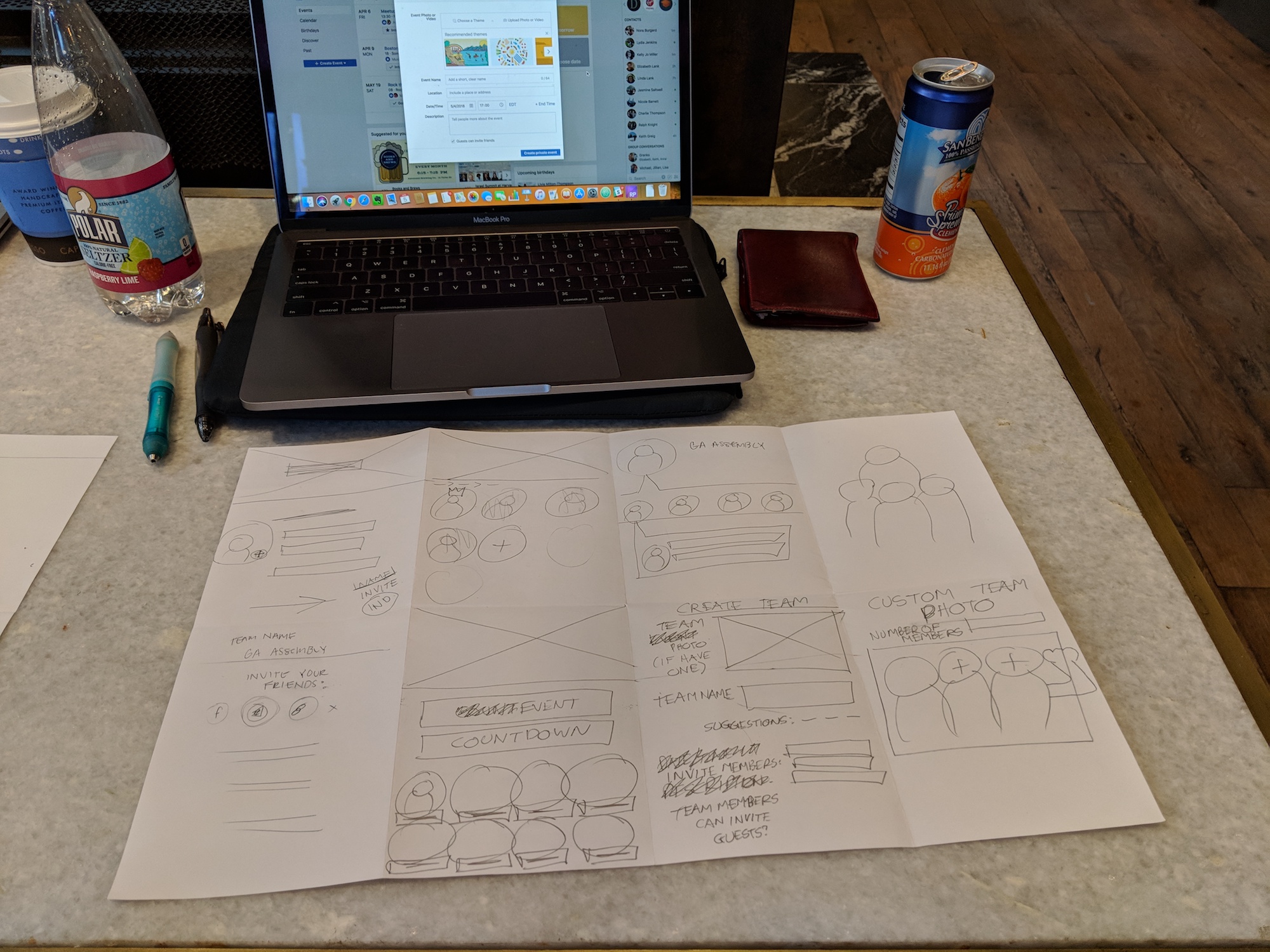
To think of possible features and solutions, our team used the Design Studio process; a timeboxed series of sketching, feedback, and iterating.
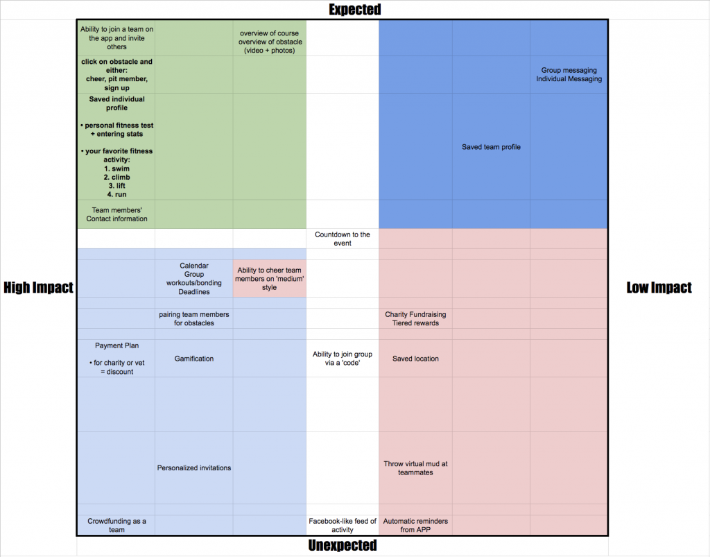
We then prioritized features based on what would be most impactful and expected for the user, and translated these into paper sketches.
Scope and trimming it down
After the first round of paper prototyping, we realized that we needed to narrow the scope of our application for what we could accomplish in the aggressive timeframe.
We had to re-evaluate and re-prioritize our features a second time.
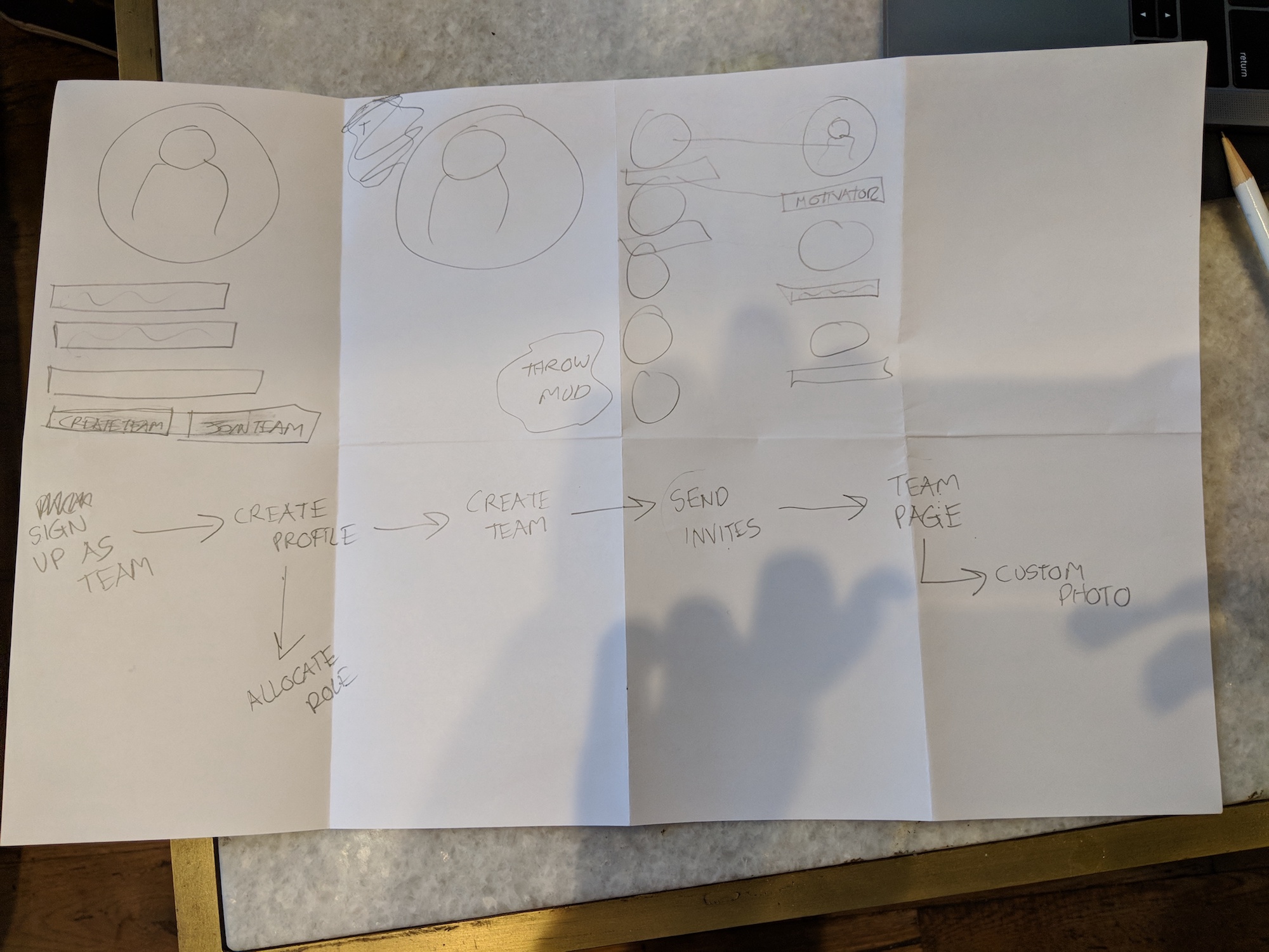
A helpful method was focusing on two user flows, and asking which screens of our app map were necessary to achieve those goals. In the end, we focused on these features.
High Impact, unexpected
- Countdown to event
- Ability to join group via a code
- Chat on obstacle page
High Impact, expected
- Create, join a team and invite others
- Coordinate team workouts
- Course and obstacle info
Below are some whiteboard sketches I did to move the team into the next phase.
I visualized the site map, screens, and mapped out the features on a whiteboard, then delegated sections of the screens for each person to work on.
Execution
The MVP: Clickable Prototype
Since we were actually trimming down on our features and screens, moving from paper to creating digital mockups in Sketch was quick. I drew 12 of the 18 total screens, and consolidated the remaining to standardize the branding and design in a master file.
I created a clickable prototype using Invision, and tested in three rounds over three days. We made a number of iterations quickly based on feedback from each round.
Feedback from user testing:
- Text was difficult to read against the background
- Consolidating team contact, course, obstacle, and training information in one app was very well received.
- Obstacle mood meter was ambiguous
- Users wanted to have a general team chat for general coordination in-app in addition to per-obstacle.
Changes made:
- More contrast between background and text for legibility
- Created a Team Roster section of the app to consolidate Team Chat and Team Contact info, instead of as an overlay on the home page
- Labeled obstacle mood meter and refined the iconography
Outcome
Next Steps
- Evaluate effectiveness by the number of enrollment, continued use, as well as increased enrollment for future Tough Mudders. Use feedback and exit surveys in addition to quantitative metrics.
- Implementation should also account for the new Tough Mudder Bootcamp training gyms and being able to sign up directly from the app.
- V2: Design and integrate loyalty discounts and coupons to address the barrier of cost.
Reflections
Test earlier, test more often; Narrowing the features and scope earlier in our prototyping process would have saved us more time. It was easy for a team full of designers to generate a lot of features and solutions, and not so easy to choose only a few. I had to put my foot down and advocate for the product by trimming down to a realistic scope.
Delegate more; As team leader, I should have given my team members more practice in sketch, as well as control in the final visual design of the high-fidelity mockup.
